 Skip to content
Over 60% of web traffic now comes from mobile devices. If your website isn’t built mobile-first, you’re losing customers.
For small businesses across Central Washington, your website is often the first impression a potential customer gets of your business. And increasingly, that first impression happens on a phone screen — not a desktop monitor.
Thank you for reading this post, don't forget to subscribe!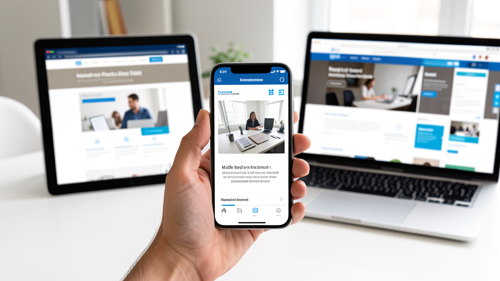
What Is Mobile-First Design?
Mobile-first design means building your website starting with the smallest screen size and working up. Rather than shrinking a desktop site to fit a phone, you design for the phone experience first, then enhance for tablets and desktops.
This approach ensures your core content, navigation calls to action look and work perfectly on the devices your customers actually use.
Why It Matters for Local Businesses
Think about how people search for local services. Someone in Central Washington looking for a plumber, restaurant, or auto shop is likely searching from their phone — often while on the go. Google has made mobile usability a ranking factor since 2015, and as of 2025, mobile-first indexing is the default for all websites.
A site that loads slowly or looks broken on mobile doesn’t just rank lower in search — it drives potential customers straight to your competitors.
Key Elements of a Mobile-First Website
- Responsive Layout: Your site should automatically adjust to any screen size without horizontal scrolling or zooming.
- Fast Load Times: Compress images, minimize code, and use caching. Aim for under 3 seconds on 4G connections.
- Touch-Friendly Navigation: Buttons and links need to be large enough to tap with a thumb — at least 44×44 pixels.
- Readable Text: Use a minimum 16px font size for body text. No zooming should be required to read your content.
- Click-to-Call Buttons: For local businesses, a prominent phone button on mobile can directly drive calls and conversions.
Common Mobile Mistakes We See
Having built websites for dozens of small businesses in the Columbia Basin area, we frequently encounter these mobile issues:
- Desktop-only designs that force users to pinch and scroll
- Uncompressed images that take 10+ seconds to load on mobile data
- Navigation menus that collapse into unusable dropdowns
- Contact forms with tiny input fields that are hard to tap
- Pop-ups that cover the entire smartphone screen with no easy close button
The Bottom Line
Mobile-first design isn’t a luxury — it’s the baseline expectation in 2026. Your customers expect a seamless experience whether they’re browsing from their laptop at home or their phone at the Central Washington Farmers Market.
If your current website was built before 2023 or wasn’t designed mobile-first, it’s time for an upgrade. Contact us for a free mobile usability review.